
Introduction & Objectives
Health insurance plays an important role in future financial planning. Insurance members are required to pay a routine payment (insurance rates) to the insurance company. This rate will be used to pay medical bill of the insurance members. therefore, determination of insurance rate becomes a critical component to ensure the sustainability of the insurance.
In this project, the author wanted to do an exploratory analysis based on known variable that may correlate with the medical bill of the said members. This project will be using personal medical bills dataset (insurance.zip) as the main source1, along with the included metadata below:
age: age of primary beneficiarysex: insurance contractor gender, female, malebmi: body mass index, providing an understanding of body, weights that are relatively high or low relative to height, objective index of body weight (kg/m2) using the ratio of height to weight, ideally18.5to24.9children: number of children covered by health insurance / number of dependentssmoker: smokingregion: the beneficiary’s residential area in the US, northeast, southeast, southwest, northwest.charges: individual medical costs billed by health insurance
At glance, bmi and smoker would likely to induce a high medical cost of a person, while age, sex, children and region may contribute in some senses or the others.
Objectives:
- Analyze the relationship between multiple
variablestomedical charges - Characterize the risk profile of members, based on the said analysis
- Determine if the insurance rate can be optimized for each
risk profile
Setting-up
Importing Dataset
| age | sex | bmi | children | smoker | region | charges | |
|---|---|---|---|---|---|---|---|
| 0 | 19 | female | 27.900 | 0 | yes | southwest | 16884.92400 |
| 1 | 18 | male | 33.770 | 1 | no | southeast | 1725.55230 |
| 2 | 28 | male | 33.000 | 3 | no | southeast | 4449.46200 |
| 3 | 33 | male | 22.705 | 0 | no | northwest | 21984.47061 |
| 4 | 32 | male | 28.880 | 0 | no | northwest | 3866.85520 |
Feature Engineering
In this dataset, the BMI is a numeric data. In order to better analyze the dataset, the bmi data can be grouped into different class/group. The classification in this project will be using BMI classification below:
| BMI | Weight Status |
|---|---|
| Below 18.5 | Underweight |
| 18.5 – 24.9 | Healthy Weight |
| 25.0 – 29.9 | Overweight |
| 30.0 and Above | Obesity |
We can use pandas.cut method to create a quick binning over bmi column.
bins= [0,18.49,24.9,30,100] #setting up the group based on bmi bins
labels = [
         'underweight',
         'healthy',
         'overweight',
         'obese'
         ] #setting up the label on each group

insurance['bmi_class']= pd.cut(
   insurance['bmi'],
   bins=bins,
   labels=labels,
   include_lowest=False
   ) #making the new column called bmi_class

#sanity check on bmi_class
(insurance
 .groupby('bmi_class')
 [['bmi', 'bmi_class']]
 .agg(['min', 'max', 'count'])
 # .style.background_gradient()
 # .style.text_gradient()
#  .T
)| bmi | bmi_class | |||||
|---|---|---|---|---|---|---|
| min | max | count | min | max | count | |
| bmi_class | ||||||
| underweight | 15.96 | 18.335 | 20 | underweight | underweight | 20 |
| healthy | 18.50 | 24.890 | 222 | healthy | healthy | 222 |
| overweight | 24.97 | 30.000 | 391 | overweight | overweight | 391 |
| obese | 30.02 | 53.130 | 705 | obese | obese | 705 |
Table 1 shows a new column bmi_class as the result of grouping the bmi data into different categories.
Quicklook
<class 'pandas.core.frame.DataFrame'>
RangeIndex: 1338 entries, 0 to 1337
Data columns (total 8 columns):
 #   Column     Non-Null Count  Dtype
---  ------     --------------  -----
 0   age        1338 non-null   int64
 1   sex        1338 non-null   object
 2   bmi        1338 non-null   float64
 3   children   1338 non-null   int64
 4   smoker     1338 non-null   object
 5   region     1338 non-null   object
 6   charges    1338 non-null   float64
 7   bmi_class  1338 non-null   category
dtypes: category(1), float64(2), int64(2), object(3)
memory usage: 74.8+ KB
The data appears to be clean, with no null row, and dftypes appear to be correct. However, the format appears to be a non-tidy format.
(insurance
 .select_dtypes(include=object) #includes all column with object dtypes
 .value_counts() #counting unique value
)
sex smoker region
female no southwest 141
southeast 139
northwest 135
male no southeast 134
northwest 132
female no northeast 132
male no southwest 126
northeast 125
yes southeast 55
northeast 38
southwest 37
female yes southeast 36
northeast 29
northwest 29
male yes northwest 29
female yes southwest 21
Name: count, dtype: int64Some observations:
2categorical data insexcolumn:femaleandmale2categorical data in thesmokercolumn,yesorno4categorical data in theregioncolumn:southwest,northwest,southeast, andnortheast
The first attempt is to see the distribution on each variable relative to each other, depending on different categories. For example, comparing mean age between smoker and non-smoker group, age between low and high bmi class, etc.
Then trying to understand the relationship of each variable with respect to the medical charges
Exploratory Data Analysis
As many people know, smoking is highly linked to clinical disease such as TBC, lung cancer, hypertension, etc. People with smoking history, may be considered a high risk profile, and as the likely outcome the medical charges may be higher than a non-smoker people.
Overall Mean age of insurance member
Show Code
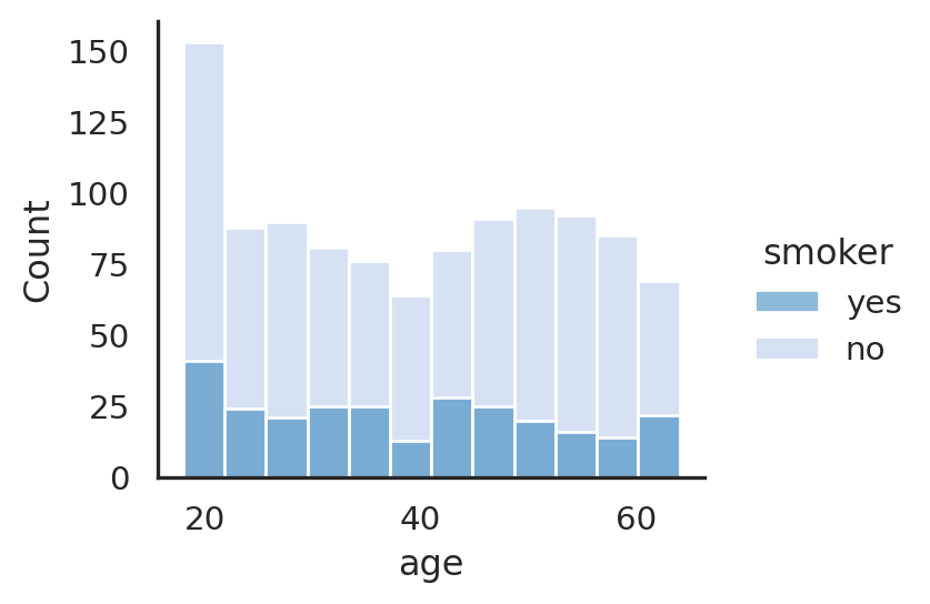
Based on distribution at Figure 1, the mean age for all insurance members is around 39 years old. There is also higher number of non-smoker compared to the total data (2 times higher) compared to smoker. There is an anomaly frequency around age of 20 that has up to 4 times higher counts. May need further check.
Mean age, bmi and charges of smoker at different sex
Show Code
| age | bmi | charges | ||
|---|---|---|---|---|
| mean | mean | mean | ||
| smoker | sex | |||
| no | female | 39.691042 | 30.539525 | 8762.297300 |
| male | 39.061896 | 30.770580 | 8087.204731 | |
| yes | female | 38.608696 | 29.608261 | 30678.996276 |
| male | 38.446541 | 31.504182 | 33042.005975 |
Calculating the ratio of smoker to non-smoker group
Show Code
| charges | |
|---|---|
| mean | |
| smoker | |
| no | 1.000000 |
| yes | 3.800001 |
Based on the above Table 2, the male bmi is always higher than the female counterpart, irrespective of its sex. Furthermore, the average bmi for smoker is slightly higher than non-smoker group.
On the other hand, the average age for female is always higher than its male counterpart, regardless of smoker or non-smoker.
As indicated by Table 3, the medical charges for is much higher in the smoker member, compared to non-smoker member, with up to 4 times higher for smoker
Show Code
| charges | |
|---|---|
| mean | |
| sex | |
| female | 1.000000 |
| male | 1.110359 |
Furthermore, Table 4 shows that male has 10% higher medical charges compared to female counterpart.
Distribution of age categorized based on sex, smoker, and bmi_class
Show Code
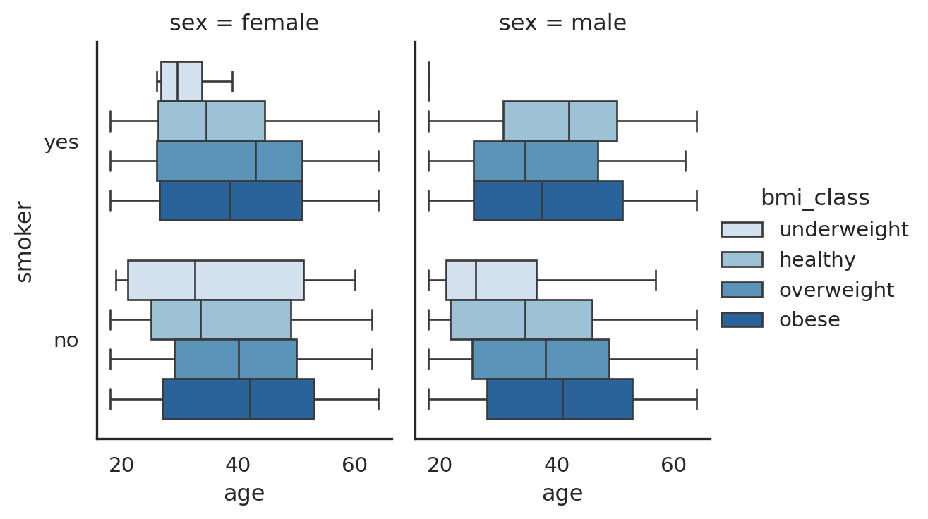
The above Figure 2 age shows a the distribution of age between smoker, bmi_class and different sex in the data. As can be seen, there is a clear trend of non-smoker where as the age increases, the bmi increases also, in both male and female group.
Whereas in the smoker group, there is no clear trend of age vs bmi. This can be further checked when using scatterplot between age and bmi vs charges.
Does region affecting the age distribution?
Show Code
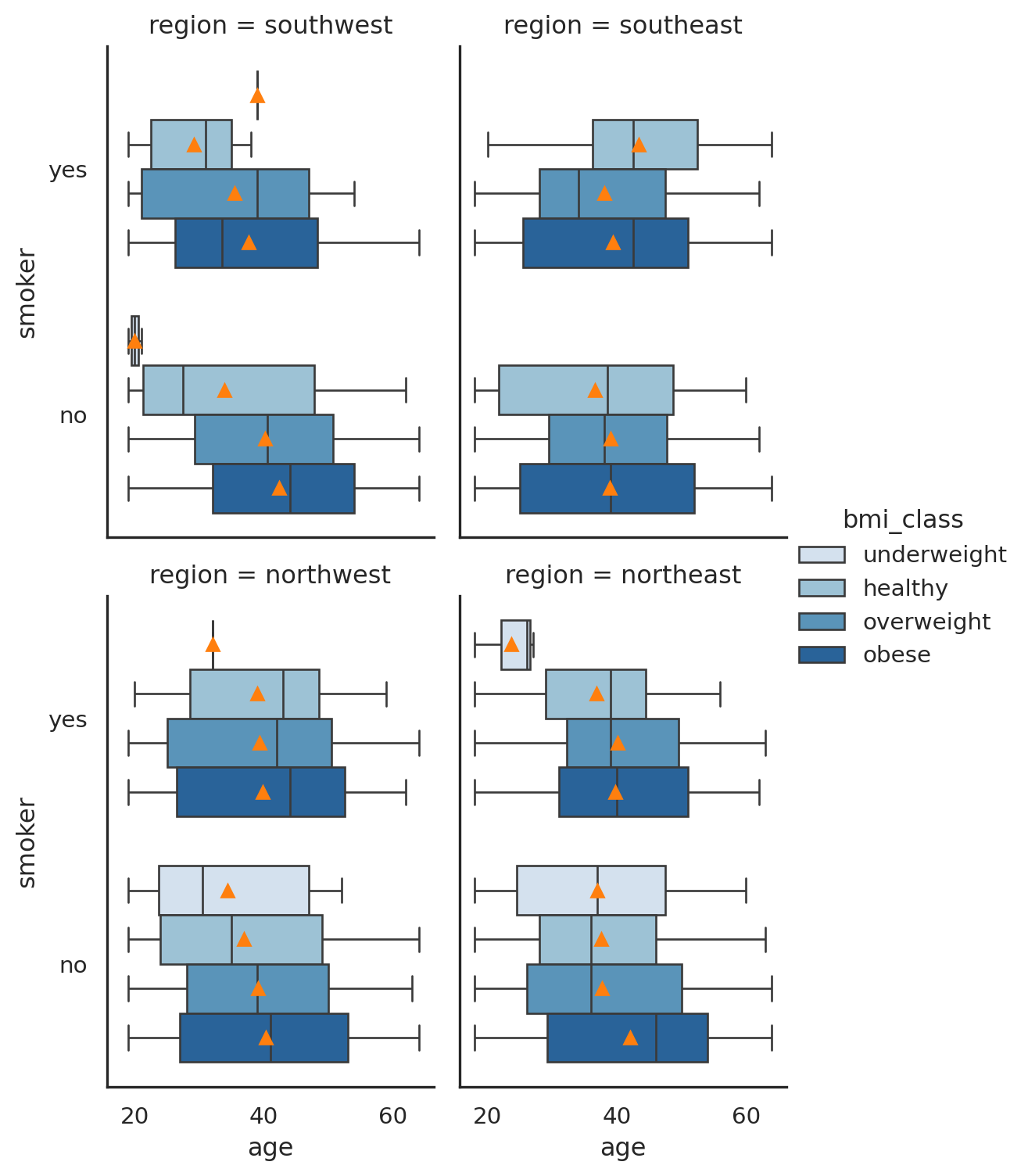
As can be seen in Figure 3, the region category does not seem to bring any value to the analysis, as the pattern with/ without region data is unclear. May need further check.
Inspecting the age vs charges based on smoker, sex, and bmi_class profile
Show Code
g=(sns
.relplot
 (data=insurance,
  x='age',
  y='charges',
  hue='smoker',
  size='bmi_class',
  style='sex',
  # legend='full',
  # col='bmi_class',
  # col_wrap=1,
  height=3.5,
  aspect=1.2,
  markers=["8","P"],
  palette='tab10',
  size_order=['obese', 'overweight', 'healthy', 'underweight']
 )
);

#setting up annotations

g.fig.text(0.6, 0.25, "I",
   color="black", fontdict=dict(size=20), fontweight='bold'
          )

g.fig.text(0.6, 0.45, "II",
   color="black", fontdict=dict(size=20), fontweight='bold'
          )

g.fig.text(0.6, 0.7, "III",
   color="black", fontdict=dict(size=20), fontweight='bold'
          )

plt.suptitle('age vs charges', y = 1.05);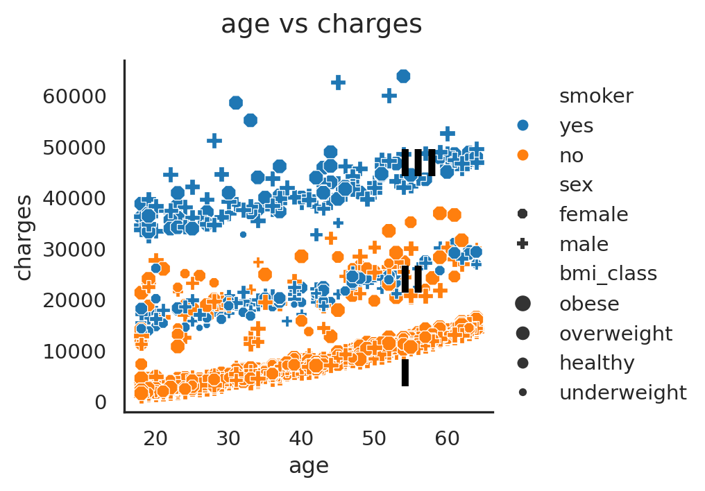
Figure 4 shows at least three groups of trend with a strong relationship between medical charges and age. As the age increases, the medical charges increases.
The three group of medical charges are as follows:
- group I:
16000and below - group II:
16000-30000 - group III: above
30000
The three group of trends were heavily affected by the smoker/ non-smoker group, as the highest group III appears to have more points with obese bmi_class. This can be further checked if we exclude non-smoker group and hue it by bmi_class, and we can put sex as the column category.
Does sex affects age vs charges distribution/trend?
Show Code
(sns
.relplot
 (data=insurance
  # .query("smoker=='yes'")
  ,
  x='age',
  y='charges',
  hue='bmi_class',
  size='bmi_class',
  style='smoker',
  # legend='full',
  col='sex',
#   col_wrap=1,
  # row='smoker',
  height=4,
  aspect=0.7,
  markers=["8","P"],
  s=300,
  palette='tab10',
  alpha=0.7,
  size_order=['obese', 'overweight', 'healthy', 'underweight'],

 )
)

plt.suptitle('age vs charges | separated by male vs female', y = 1.05);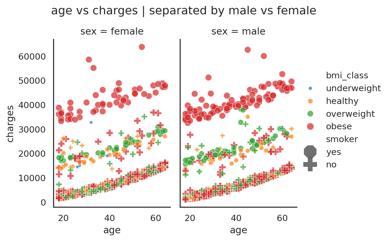
Couple conclusions can be drawn from these Figure 4 and Figure 5:
- That the
male is likely to have higher medical chargescompared to female, with relatively small difference (Table 4). - There are three groups of strong trend between age vs charges, where as the age increases in all trends, the medical charges is likely to increases as well.
- The three groups can be characterized from low-high charges as follows:
- Group
I: medical charges between0-16,000, predominantlynon-smoker,and a mix between all bmi_class. - Group
II: medical charges between12,000-30,000, a mix betweensmoker and non-smoker group, and bmi_class of healthy andoverweight. - Group
III: medical charges above30,000, predominantlyobesebmi_class andsmoker.
- Group
Some observed outlier (group I-a) between group I and II?
Show Code
g = (sns
.relplot
 (data=insurance,
  x='age',
  y='charges',
  hue='bmi_class',
  size='bmi_class',
  style='smoker',
  # legend='full',
  col='smoker',
  # col_wrap=1,
  # row='smoker',
  height=4,
  aspect=0.7,
  markers=["8","P"],
  s=300,
  palette='tab10',
  alpha=0.7,
  size_order=['obese', 'overweight', 'healthy', 'underweight'],
 )
);

#annotations

g.fig.text(0.6, 0.22, "I",
   color="black", fontdict=dict(size=20), fontweight='bold'
          )

g.fig.text(0.3, 0.4, "II",
   color="black", fontdict=dict(size=20), fontweight='bold'
          )

g.fig.text(0.3, 0.63, "III",
   color="black", fontdict=dict(size=20), fontweight='bold'
          )

g.fig.text(0.65, 0.4, "I-a",
   color="black", fontdict=dict(size=20), fontweight='bold'
          )


plt.suptitle('age vs charges | separated by smoker vs non-smoker', y = 1.05);
If we look at the above Figure 6, in the non-smoker group, there is a cloud of data below the group II is. This needs further check, as what would affect the scattered data across this category, as it looks like there is another factor (aside from what was plotted already) that affects the data “moves up” (increased medical charges)
What affects the outlier/ I-a group?
Show Code
(sns
.relplot
 (data=insurance.query('smoker == "no"'),
  x='age',
  y='charges',
  hue='bmi_class',
  # size='children',
  style='sex',
  legend='full',
  col='children',
  col_wrap=2,
  # row='region',
  height=3,
  aspect=1,
#   markers=["8","P"],
  # s=400,
  palette='tab10',
  alpha=0.7,
  # size_order=['obese', 'overweight', 'healthy', 'underweight'],
 )
);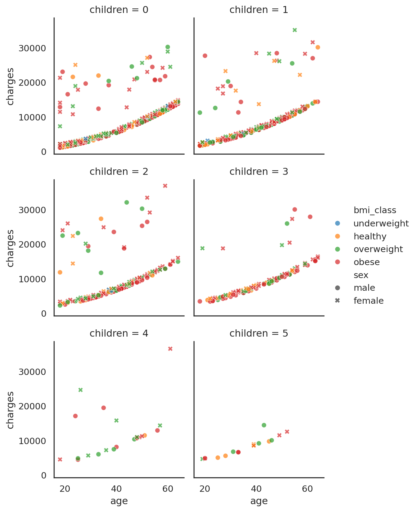
Figure 7 shows just group I and I-a where we see through zero to six number of childrens, colored by bmi_class and styled by sex. As can be seen, there is no clear differentiator between group I and I-a, as the number of children increases, it affects both group I and I-a also.
It is unclear as to why this is happening. Perhaps other factors plays a role. At the time of this writing, author decided to categorized the group I-a as the outlier.
Show Code
g = (sns
.relplot
 (data=insurance,
  x='bmi',
  y='charges',
  hue='smoker',
  size='children',
  # style='sex',
  # legend='full',
  # col='bmi_class',
  # col_wrap=1,
  height=3.5,
  aspect=1,
  markers=["8","P"],
  palette='tab10',
  size_order=[1,2,3,4,5,6]
 )
)

#annotations
g.fig.text(0.35, 0.25, "I",
   color="black", fontdict=dict(size=18), fontweight='bold'
          )

g.fig.text(0.35, 0.45, "II",
   color="black", fontdict=dict(size=18), fontweight='bold'
          )

g.fig.text(0.6, 0.65, "III",
   color="black", fontdict=dict(size=18), fontweight='bold'
          )

g.fig.text(0.5, 0.45, "I-a",
   color="black", fontdict=dict(size=18), fontweight='bold'
          )

plt.suptitle('bmi vs charges', y = 1.05);
Similar to the previous Figure 5, in Figure 8 we can see that the non-smoker group overlaps with the smoker group at around 16,000-30,000 medical charge range.
Conclusions and Outcomes
The insurance member can be characterzed based on the
smokerprofile,age,bmi/bmi_class, andsexprofile.The
criticalfactor for a high medical charges is whether member is asmokeror not, followed byageand thenbmi2.Other variable such as the
number of children/ dependant is not playing a role, whereassexprofileaffect the charges slightly3.There is a
strong relationship between age and medical charges, with3strong group categorized bysmokerandbmiprofile. The big three groups are:- Group I: medical charges below 16k, related to a group of
non-smoker4. - Group II: medical charges between 16k-30k, related to a group of
smokerandoverweight. - Group III: medical charges above 30k, related to a group of
smokerandobese.
These three groups have its own trendline which can be later determined (trendline).
- Group I: medical charges below 16k, related to a group of
There is also one
outlieror groupI-a, where it isunclear as to what affects the medical charges increaseto be between group I and II.
The above groups (I, II, III) can be used for risk profiling, where based on its profile, the associated risk related to medical charges can be determined. Since each group forms a trendline (simple linear regression), and can be categorized based on its smoker, and bmi profile. Based on this approach, one can estimate the optimum pricing for each risk profile (based on its medical charges).
See below flowchart for simple ilustration.
flowchart LR
    A[Member] --> B{Smoking}
    B --> |No| C[trendline Group I]
    B --> |Yes| D{BMI Class}
    D --> |Overweight| E[trendline Group II]
    D --> |Obese| F[trendline Group III]
The next step would be using some of these knowledge to further investigate the likelihood (probability) of each risk profile based on its numeric (age-bmi) and categorical variable (smoker-bmi-region-sex).
Footnotes
Citation
@online{wijaya2022,
  author = {Wijaya, A.A.},
  title = {Medical {Insurance} {Cost} - {Exploratory} {Analysis}},
  date = {2022-10-27},
  url = {https://adtarie.net/posts/003-medical-insurance/},
  langid = {en}
}