Decoupling GDP from CO2 Emission - Only If You’re Rich Enough?
Developed countries were able to decoupled their GDP from CO2 emissions, while in developing countries, CO2 emissions is an inevitable consequences of their economic growth.
energy
emission
Author
A.A. Wijaya
Published
July 23, 2023
Modified
August 23, 2024
CO2 Emission vs GDP - Decoupled Economy
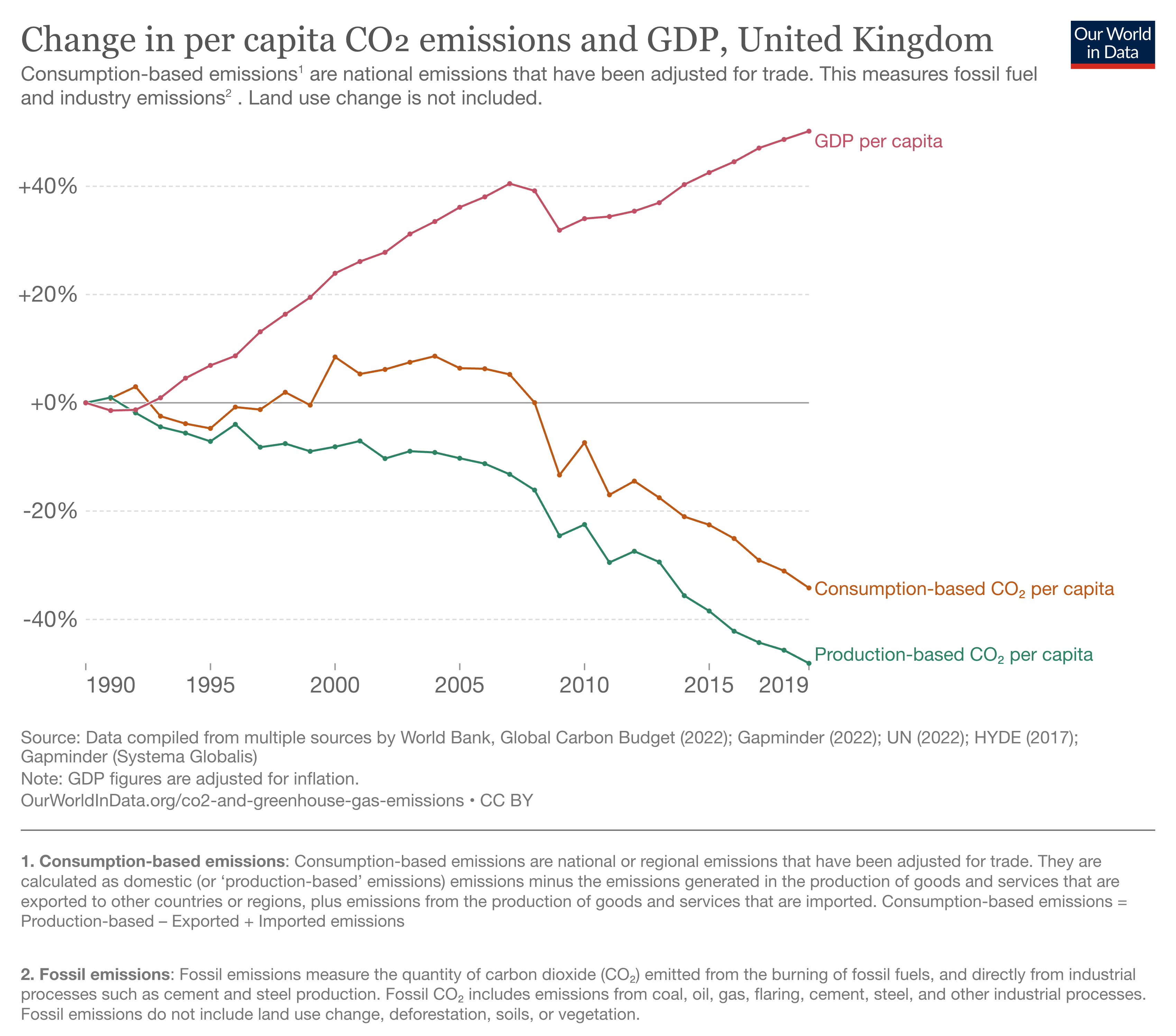
Our World in Data (OWID) shows some examples from a country that was able to decoupled their economy from CO2 emission. Decoupling economy is an economy where they still able to increase their GDP while at the same time reducing CO2 emission. UK is the example used in Figure 1.
Figure 1: United Kingdom Decoupled CO2 Emission vs Economic Growth
You can read the full article, but quoting a paragraph that interest me to write this article.
“These countries show that economic growth is not incompatible with reducing emissions.”
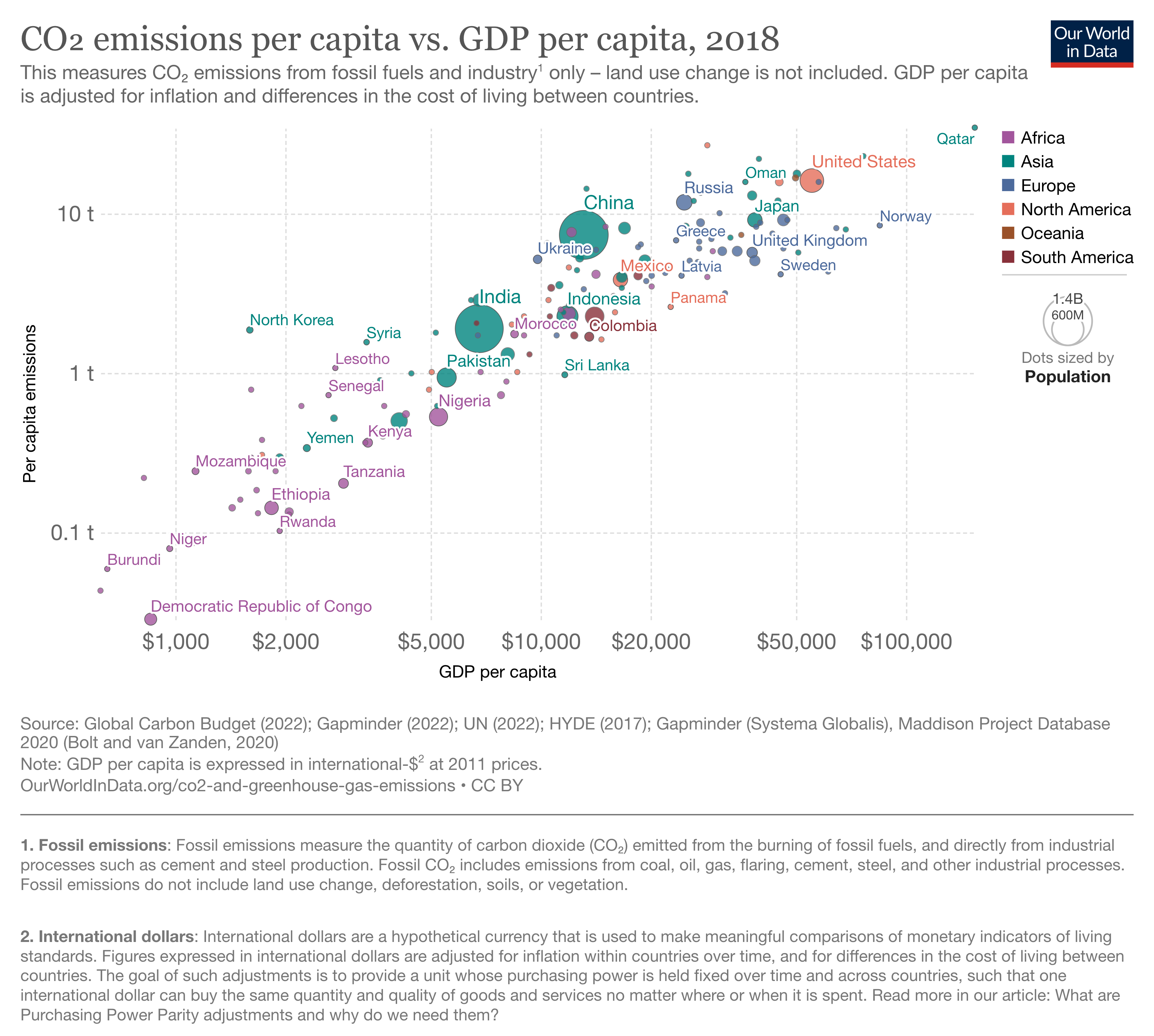
The narrative implies that you can grow your economy without emitting emission - a rather different statement considering the other chart from Figure 2 where the GDP (representing the economy strength) of a country is strongly related to the CO2 emission.
Even OWID themselves explained:
“Historically, CO2 emissions have been strongly correlated with how much money we have. This is particularly true at low-to-middle incomes. The richer we are, the more CO2 we emit. This is because we use more energy - which often comes from burning fossil fuels.” (source: Our World in Data)
Figure 2: CO2 Emission per Capita vs GDP per Capita
A country needs energy to grow their economy, the higher the energy consumption the higher the CO2 emission would be. The narrative that a country emits more CO2 because they are rich can be misleading.
It is not because we are rich we emit more CO2, but we are rich because we emit more CO2 used for energy, to grow the economy.
This is not to undermine the impact of CO2 emission to our global temperature, rather a proposal – to manage our expectations and a reality check on what can really be done. Some questions about “can we reduce our CO2emission but still maintaining economy growth”? Or “do we have to increase our CO2to raise our economic growth?” are some fair questions to be addressed in more detail.
Despite some articles pointed out the fact that some countries were able to decoupled their economy from CO2 emission as shown in Figure 1, it is important to understand the context, in which these countries were positioned compared to rest of the world.
This article will explore a dataset, contains emission from different countries, and to see correlation and infer some causality (if any) between economic growth and emissions. Hopefull would shed some lights on the final question:
What allows these countries to decouple their economy from emissions?
Data Importing and Cleaning
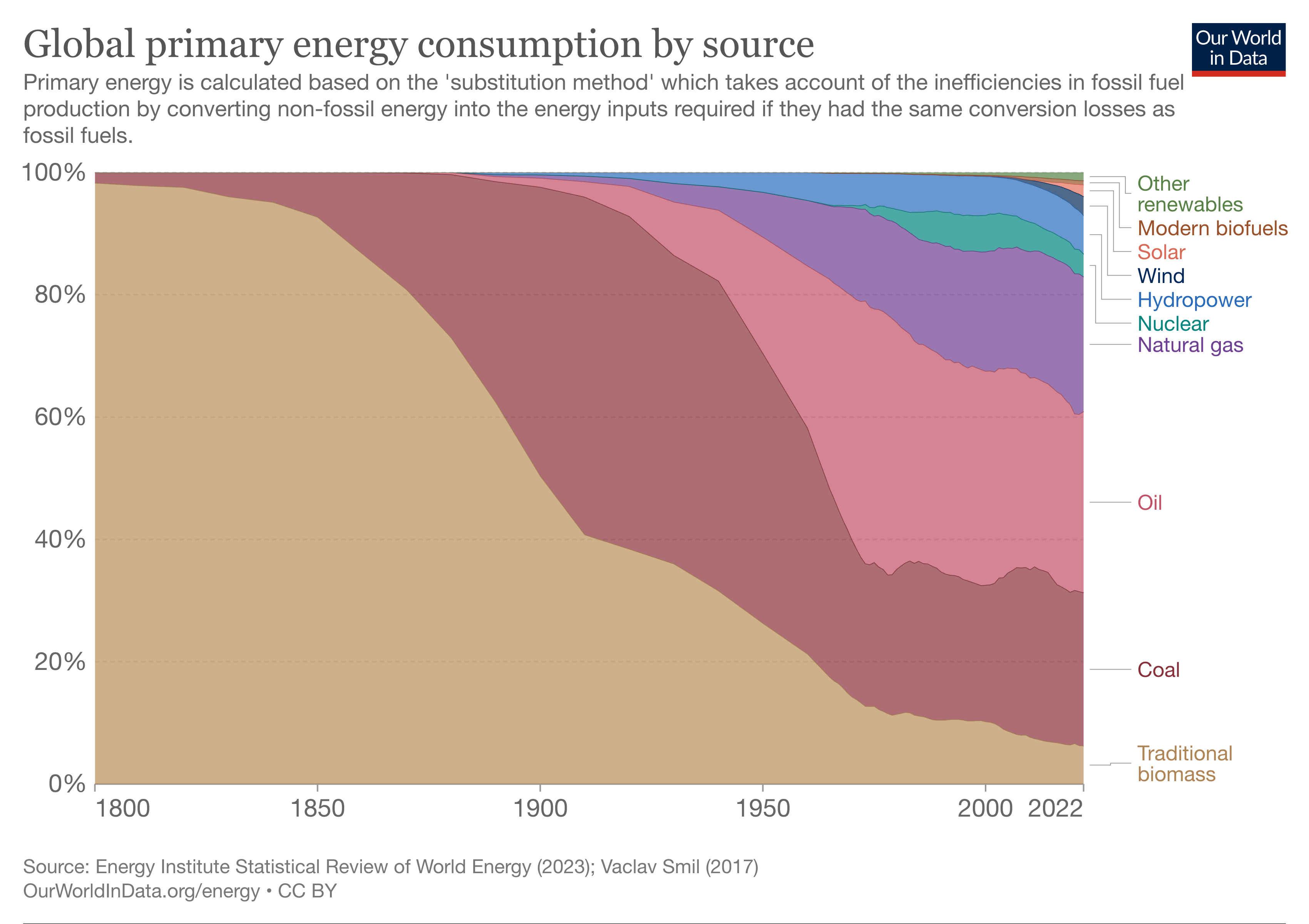
Exploring the CO2 emission dataset provided by the OWID (Our World in Data). The focus will be on the CO2 emission and it’s impact to GDP of a country. The premise stays the same, that a country must burn the energy to grow their economy, and to do that they will have to emit CO2, since more than 80% of energy (see Figure 3) in the world still comes from fossil-fuels (oil, gas, coal).
Figure 3: Global Energy Consumption
The dataset is downloaded from the provided link in the code block below.
There are over 70 columns in the original dataset, we will only use columns that we are interested in, mainly related to GDP and CO2 emission of a country, referenced by year. Some data cleaning (removing any null rows in GDP per Capita, or CO2 consumption per Capita, etc.).
Show Code
#selecting datasetco2 = co2_raw[[ 'country', 'year','population', 'gdp', 'co2_per_capita', 'consumption_co2_per_capita' ]]#adding gdp per capita columnco2['gdp_per_capita'] = co2['gdp']/ co2['population']# dropping any rows with null consumption_co2_per_capitaco2 = co2[~co2.consumption_co2_per_capita.isnull()].reset_index(drop=True)#drop gdp columnco2 = co2.drop(columns='gdp')#removing any incomplete dataco2 = co2.query(" gdp_per_capita>0 & co2_per_capita>0")co2.dropna().sample(5)
country
year
population
co2_per_capita
consumption_co2_per_capita
gdp_per_capita
232
Austria
1998
7975856.0
8.390
12.345
32570.340809
1125
El Salvador
1995
5748201.0
0.870
1.154
4369.935718
2768
New Zealand
2006
4179986.0
8.931
9.530
31297.629066
3606
Spain
1999
40542232.0
7.352
7.783
25446.336118
3207
Portugal
2016
10332751.0
4.874
5.276
25365.954418
Combining it with the Gapminder dataset1, and with the previously curated CO2 dataset we just created - we can have countries to add more context.
Show Code
#importing gapmindergapminder=pd.read_csv('https://raw.githubusercontent.com/plotly/datasets/master/gapminderDataFiveYear.csv')gapminder = gapminder[['country', 'continent']]gapminder = gapminder.drop_duplicates().reset_index(drop=True)#merging with original co2 datasetco2 = pd.merge(co2, gapminder, on='country', how='inner')#drop consumption per capitaco2 = co2.drop(columns='consumption_co2_per_capita')#sanity checkco2
country
year
population
co2_per_capita
gdp_per_capita
continent
0
Albania
1990
3295073.0
1.675
3929.457471
Europe
1
Albania
1991
3302087.0
1.299
2839.372990
Europe
2
Albania
1992
3303738.0
0.762
2647.205908
Europe
3
Albania
1993
3300715.0
0.708
2919.471012
Europe
4
Albania
1994
3294001.0
0.584
3216.791504
Europe
...
...
...
...
...
...
...
3078
Zimbabwe
2017
14751101.0
0.630
1733.837618
Africa
3079
Zimbabwe
2018
15052191.0
0.712
1779.559752
Africa
3080
Zimbabwe
2019
15354606.0
0.637
1637.711652
Africa
3081
Zimbabwe
2020
15669663.0
0.501
1479.209026
Africa
3082
Zimbabwe
2021
15993525.0
0.525
1571.891677
Africa
3083 rows × 6 columns
Expanding on the GDP per Capita, we can infer from which income class is a certain country belongs to. Using a rough classification by world-bank (may not be the best representation as income class is not the same every year2), but good enough for the purpose of this writing.
Show Code
#creating income class category based on gdp per capita. bins= [0.00001,1000,4000,12000,1000000] #setting up the group based on bmi bins labels = ['lower','lower-middle','upper-middle','upper' ] #setting up the label on each groupco2['income_class']= pd.cut( co2['gdp_per_capita'], bins=bins, labels=labels, include_lowest=False )co2
country
year
population
co2_per_capita
gdp_per_capita
continent
income_class
0
Albania
1990
3295073.0
1.675
3929.457471
Europe
lower-middle
1
Albania
1991
3302087.0
1.299
2839.372990
Europe
lower-middle
2
Albania
1992
3303738.0
0.762
2647.205908
Europe
lower-middle
3
Albania
1993
3300715.0
0.708
2919.471012
Europe
lower-middle
4
Albania
1994
3294001.0
0.584
3216.791504
Europe
lower-middle
...
...
...
...
...
...
...
...
3078
Zimbabwe
2017
14751101.0
0.630
1733.837618
Africa
lower-middle
3079
Zimbabwe
2018
15052191.0
0.712
1779.559752
Africa
lower-middle
3080
Zimbabwe
2019
15354606.0
0.637
1637.711652
Africa
lower-middle
3081
Zimbabwe
2020
15669663.0
0.501
1479.209026
Africa
lower-middle
3082
Zimbabwe
2021
15993525.0
0.525
1571.891677
Africa
lower-middle
3083 rows × 7 columns
Data Exploration and Illustration
The first exploration of the data is to see how much change every country experiencing with over the course of 28 years from 1990-2018, and how the relationship between CO2 emission per Capita vs GDP per Capita look like.
Figure 4 shows the time-lapse between years, annotated to some countries from low (e.g. Ethiopia, Bangladesh), middle (e.g. Indonesia, India) to high (Singapore, USA, UK, etc.) GDP per CO2 Ratio.
The position is relatively stable especially for high-income countries like US, UK, and Germany, but drastic change for low-middle income countries.
Show Code
import plotly_express as pxsource = co2#selected countries to annotatehighlighted_countries = ['United States', 'Germany', 'United Kingdom','China', 'Singapore','Mexico', 'India', 'Indonesia', 'Nigeria', 'Vietnam', 'Bangladesh', 'Ethiopia' ]# Create a new column for text values based on the conditionsource['text_value'] = source['country'].apply(lambda country: country if country in highlighted_countries else'')fig = px.scatter(data_frame=source, x="co2_per_capita", y="gdp_per_capita", animation_frame="year", animation_group="country", size="population", color="continent", hover_name="country", log_x =True, log_y=True, size_max=80, width=700, height=800,# text_baseline='bottom', range_x=[0.01,100], range_y=[400,90000], text='text_value' )fig.update_layout(# title='CO2 Emission vs GDP of Countries', xaxis_title='CO2 Emission per Capita (tonnes)', yaxis_title='GDP per Capita (USD)', legend=dict( orientation="h", yanchor="bottom", y=1.02, xanchor="right", x=1))fig.show()
Figure 4: 1990-2018 Time-lapse Chart of CO2 Emission and GDP per Country
Country with Decreased CO2 Emission & Increased GDP - Decoupling Countries
Recalling some articles from OWID, where they pointed out some countries such as United Kingdom, where the economic growth still happening while at the same time, reducing the CO2 emission as shown in Figure 1. It sounds impressive, but from the Figure 5 below, it is quite clear on why some countries like United Kingdom, Germany or USA were able to decoupled their economy from their CO2 emissions.
Because they are already rich.
Decoupling concept itself is based on a premise of decreased from the previous data point. The low-income countries, cannot possibly have lower data point - it is already low! Meanwhile, for rich countries, fonce it gets saturated - their only way is to go down. It is easy to ignore the fact that those countries were sitting on top of other countries in terms of income level, with GDP per Capita at the high-income class countries, consistently above 20,000 USD ever since 1990!
The narrative that a country can really keep increasing their GDP per Capita without producing more CO2 emission is an oversimplification of the whole set of conditions that allow a country to do so.
Show Code
import altair as althighlighted_countries = ['India', 'Indonesia', 'United Kingdom', 'Germany', 'United States']source=co2[co2['country'].isin(highlighted_countries)]alt.Chart( source, title=alt.Title("GDP per Capita vs CO2 Emission", subtitle=["Different CO2 vs GDP rate in different Countries"], anchor='middle', offset=10, fontSize=16, ) ).mark_point(size=90, filled=True, opacity=0.7).encode( x=alt.X('co2_per_capita:Q', title='CO2 per Capita', scale=alt.Scale(type="log", domain=[0.3, 30]) ), y=alt.Y('gdp_per_capita:Q', title='GDP per Capita', scale=alt.Scale(type="log") ), color=alt.Color('year', title='Year'), shape=alt.Shape('country', title='Country'), tooltip=['country', 'population', 'co2_per_capita', 'gdp_per_capita', 'year']).properties( width='container', height=480,)#.interactive()
Figure 5: CO2 vs GDP per Capita for some countries with different trend
The Figure 5 shows that 20,000 is a tipping point - where some affluent countries started to be able to decoupling their CO2 emission from GDP. To be rich, a country will have to use more energy, and likely to produce more CO2 emissions because of that. As context, a modest estimation of 5% GDP growth, and 2% inflation rate, it will take 7 years, before Indonesia can reach 20,000 USD per Capita level.
These are affluent countries, what about the rest of the countries with less GDP per capita. Do we see similar tipping point? To answer that, we need to do some tinkering with the data as below.
Show Code
# create a column for gdp changes between 1990-2018# Pivot the DataFrame to have years as columnsgdp_df = co2.pivot(index='country', columns='year', values='gdp_per_capita')# pivoted_df# Calculate the difference between GDP values for years 1980 and 2018gdp_df['gdp_diff'] = gdp_df[2018] - gdp_df[1990]# Reset the index to convert the DataFrame back to the original formatgdp_df.reset_index(inplace=True)# Merge the calculated difference back to the original DataFramemerged_df = pd.merge(co2, gdp_df[['country', 'gdp_diff']], on='country', how='left')merged_df
country
year
population
co2_per_capita
gdp_per_capita
continent
income_class
text_value
gdp_diff
0
Albania
1990
3295073.0
1.675
3929.457471
Europe
lower-middle
7404.844274
1
Albania
1991
3302087.0
1.299
2839.372990
Europe
lower-middle
7404.844274
2
Albania
1992
3303738.0
0.762
2647.205908
Europe
lower-middle
7404.844274
3
Albania
1993
3300715.0
0.708
2919.471012
Europe
lower-middle
7404.844274
4
Albania
1994
3294001.0
0.584
3216.791504
Europe
lower-middle
7404.844274
...
...
...
...
...
...
...
...
...
...
3078
Zimbabwe
2017
14751101.0
0.630
1733.837618
Africa
lower-middle
-389.441120
3079
Zimbabwe
2018
15052191.0
0.712
1779.559752
Africa
lower-middle
-389.441120
3080
Zimbabwe
2019
15354606.0
0.637
1637.711652
Africa
lower-middle
-389.441120
3081
Zimbabwe
2020
15669663.0
0.501
1479.209026
Africa
lower-middle
-389.441120
3082
Zimbabwe
2021
15993525.0
0.525
1571.891677
Africa
lower-middle
-389.441120
3083 rows × 9 columns
Do the same for CO2 Emissions between 1990-2018.
Show Code
# create a column for co2 changes between 1990-2018# Pivot the DataFrame to have years as columnsco2_df = co2.pivot(index='country', columns='year', values='co2_per_capita')# pivoted_df# Calculate the difference between GDP values for years 1980 and 2018co2_df['co2_diff'] = co2_df[2018] - co2_df[1990]# Reset the index to convert the DataFrame back to the original formatco2_df.reset_index(inplace=True)# Merge the calculated difference back to the original DataFramemerged_df = pd.merge(merged_df, co2_df[['country', 'co2_diff']], on='country', how='left')merged_df
country
year
population
co2_per_capita
gdp_per_capita
continent
income_class
text_value
gdp_diff
co2_diff
0
Albania
1990
3295073.0
1.675
3929.457471
Europe
lower-middle
7404.844274
0.026
1
Albania
1991
3302087.0
1.299
2839.372990
Europe
lower-middle
7404.844274
0.026
2
Albania
1992
3303738.0
0.762
2647.205908
Europe
lower-middle
7404.844274
0.026
3
Albania
1993
3300715.0
0.708
2919.471012
Europe
lower-middle
7404.844274
0.026
4
Albania
1994
3294001.0
0.584
3216.791504
Europe
lower-middle
7404.844274
0.026
...
...
...
...
...
...
...
...
...
...
...
3078
Zimbabwe
2017
14751101.0
0.630
1733.837618
Africa
lower-middle
-389.441120
-0.826
3079
Zimbabwe
2018
15052191.0
0.712
1779.559752
Africa
lower-middle
-389.441120
-0.826
3080
Zimbabwe
2019
15354606.0
0.637
1637.711652
Africa
lower-middle
-389.441120
-0.826
3081
Zimbabwe
2020
15669663.0
0.501
1479.209026
Africa
lower-middle
-389.441120
-0.826
3082
Zimbabwe
2021
15993525.0
0.525
1571.891677
Africa
lower-middle
-389.441120
-0.826
3083 rows × 10 columns
With this new dataset, we can confirm our exploratory analysis before,
Are there decoupling countries with less than 20,000 USD GDP Per Capita?
Figure 6 shows a distribution of countries where the their GDP per Capita increases between 1990-2018, while their CO2 emissions were decreased (decoupling countries). As shown, not every country created equally, as different country has different tipping point.
However, as can be seen all countries were sitting above upper-middle income class at around 4,500 USD GDP per Capita.
Show Code
import numpy as npimport altair as alt#country with increase gdp, but decreased co2source=merged_df.query(" gdp_diff>0 & co2_diff<0 & population >= 5_000_000")alt.Chart( source, title=alt.Title("Decoupling Countries", subtitle=["At least 5 Million population,", "Increased GDP while Reducing CO2 Emissions"], fontSize=16, offset=10 ) ).mark_point(size=90, filled=True, opacity=0.6).encode( x=alt.X('co2_per_capita:Q', title='CO2 per Capita', scale=alt.Scale(type="log", domain=[0.5,50]) ), y=alt.Y('gdp_per_capita:Q', title='GDP per Capita', scale=alt.Scale(type="log") ), color=alt.Color('country', title='Country'), size=alt.Size('year:O', scale=alt.Scale(domain=list(np.linspace(1990,2020,10, dtype=int))), title='Year'), tooltip=['country', 'population', 'co2_per_capita', 'gdp_per_capita', 'year']).properties( width='container', height=480,)#.interactive()
Figure 6: Countries with low CO2 Emission and increase GDP (countries with minimum 2 Million population)
One of the factor to differentiate between these countries in tipping point is population among other things. Kaya identity, listed four factors affecting the emission of a country. One of them is population.
In addition, cumulatively-speaking, emission from populous countries are important to be considered. My country Indonesia, has roughly 280 Million people, and I would imagine it as Youtuber CEO used to say with a hint of aforementioned context;
Problem at Youtube (populous countries) is problem at Scale
Are there any country that was able to decouple their economy, while having high population (at least 100 Million)?
Show Code
import altair as alt#country with increase gdp, but decreased co2source=merged_df.query(" gdp_diff>0 & co2_diff<0 & population >= 100_000_000")alt.Chart( source, title=alt.Title("Decoupling Countries", subtitle=["At least 100 Million population,", "Increased GDP while Reducing CO2 Emissions"], fontSize=16, offset=10 ) ).mark_point(size=90, filled=True, opacity=0.6).encode( x=alt.X('co2_per_capita:Q', title='CO2 per Capita', scale=alt.Scale(type="log", domain=[3,30]) ), y=alt.Y('gdp_per_capita:Q', title='GDP per Capita', scale=alt.Scale(type="log",domain=[1000, 100_000]) ), color=alt.Color('country', title='Country'), size=alt.Size('year:O', scale=alt.Scale(domain=list(np.linspace(1990,2020,10, dtype=int))), title='Year'), tooltip=['country', 'population', 'co2_per_capita', 'gdp_per_capita', 'year']).properties( width='container', height=480,)#.interactive()
Figure 7: Countries with low CO2 Emission and increase GDP (countries with minimum 100 Million population)
There are, three countries, in the entire world - that was able to decoupled, when the population is at least 100 million.
The interesting part is, all of them is way above the previous tipping point of upper-middle income class (4,500 USD GDP per Capita). These countries tipping point is about 10,000 USD before they can start to decoupled their economy from emissions.
To conclude.
No Countries in the last decades was able to decouple without being rich at least above 4500 USD GDP per Capita for less populous countries (5 Million), and at least 10,000 USD GDP per capita for populous countries (100 Million).
Country with Increased CO2 Emission & Increased GDP
This is probably the category where it gets tricky. These countries, not only among the fastest growing countries in the world, biggest emitter in the last decades, but also among the most populous countries in the world. Critical to asses their approach to emissions, relative to their carbon budget, historical aspect, and their tipping point (income level). As shown in Figure 8, these countries are all on the increasing trend, their GDP per capita is increasing but at the same time they were emitting CO2.
Show Code
import altair as alt#country with increased CO2 and GDPsource=merged_df.query(" gdp_diff>0 & co2_diff>0 ")alt.Chart( source, title=alt.Title("GDP per Capita vs CO2 Emission for Countries", subtitle=["Countries with Increased GDP and CO2 Emission"], fontSize=16, offset=10 ) ).mark_point(size=90, filled=True, opacity=0.6).encode( x=alt.X('co2_per_capita:Q', title='CO2 per Capita', scale=alt.Scale(type="log",) ), y=alt.Y('gdp_per_capita:Q', title='GDP per Capita', scale=alt.Scale(type="log") ), color=alt.Color('country', title='Country'), size=alt.Size('year:O', scale=alt.Scale(domain=list(np.linspace(1990,2020,10, dtype=int))), title='Year'), tooltip=['country', 'population', 'co2_per_capita', 'gdp_per_capita', 'year']).properties( width='container', height=480,)#.interactive()
Figure 8: Countries with increased CO2 Emission and GDP
Looking at some countries such as Indonesia, Vietnam, India, it is clear that these countries are trying to grow their economy from below 4,000 USD GDP per Capita in 1990, to hopefully near 20,000 USD GDP per Capita (just like any other rich countries in Figure 5), in the foreseeable future.
Show Code
import altair as alt#country with increased CO2 and GDPsource=merged_df.query(" gdp_diff>0 & co2_diff>0 & population > 50_000_000 ")alt.Chart( source, title=alt.Title("GDP per Capita vs CO2 Emission for Countries", subtitle=["Countries with Increased GDP and CO2 Emission", " with population more than 50 Million "], fontSize=16, offset=10 ) ).mark_point(size=90, filled=True, opacity=0.6).encode( x=alt.X('co2_per_capita:Q', title='CO2 per Capita', scale=alt.Scale(type="log",) ), y=alt.Y('gdp_per_capita:Q', title='GDP per Capita', scale=alt.Scale(type="log") ), color=alt.Color('country', title='Country'), size=alt.Size('year:O', scale=alt.Scale(domain=list(np.linspace(1990,2020,10, dtype=int))), title='Year'), tooltip=['country', 'population', 'co2_per_capita', 'gdp_per_capita', 'year']).properties( width='container', height=480,)#.interactive()
Figure 9: Countries with increased CO2 Emission and GDP
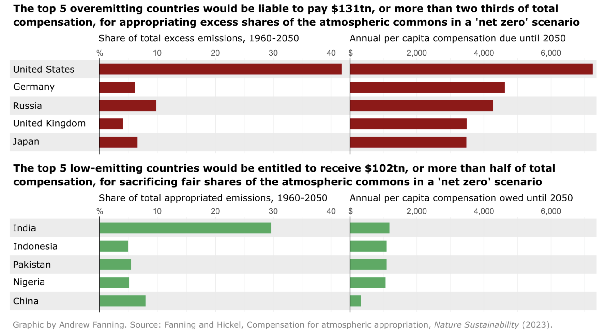
On the one hand, some developed countries, the one that were referred as an example for a country that successfully decoupled their CO2 emission from their economic growth are proved to be still overemitting. In fact, the top 5 countries such as United States, Germany and United Kingdom are still in the excess shares with respect to the net-zero scenario (Fanning and Hickel 2023).
On the other hand, some developing countries like India, Indonesia, Pakistan, and even China still have their carbon share to be used, as they are sacrificing their fair shares with respect to the net-zero scenario. See Figure 10 for more details.
Figure 10: Top 5 Overemitting and Underemitting Countries with respect to Net Zero scenario (Fanning and Hickel 2023)
Country with Decreased CO2 Emission & Decreased GDP
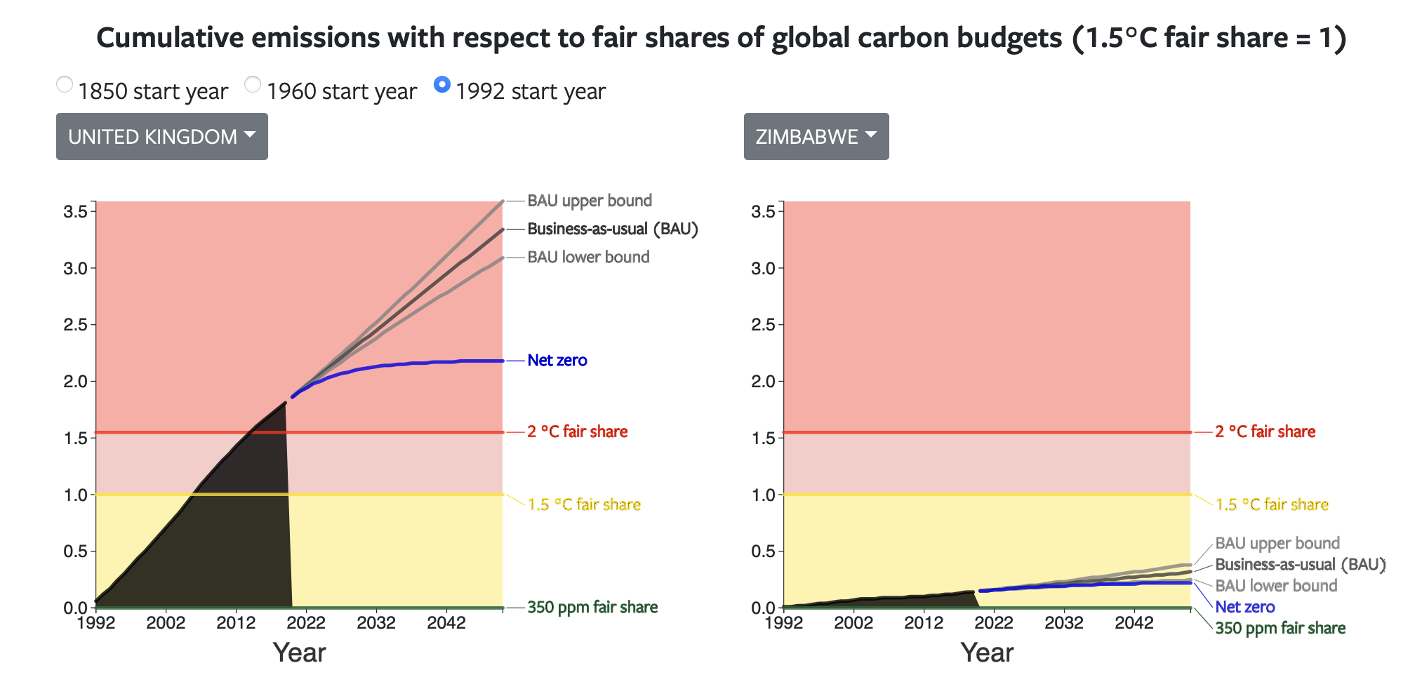
This is part where we should allow their CO2 emission to grow because it is directly related to the their economic growth. Figure 12 shows country with worse condition in 2018 than they are in 1990, Zimbabwe. Another important concept is carbon budget, where each country, depending on their population should have quota / “budget” of CO2 they were allowed to use. And in this case, Zimbabwe carbon budget is still below their fair share, as shown in Figure 11, a night and day difference compared to UK carbon share3.
Figure 11: Cumulative emission on UK and Zimbabwe compared to their respective Carbon Budget (Fanning and Hickel 2023)
Show Code
import altair as alt#country with decreased CO2 and GDPsource=merged_df.query(" gdp_diff<0 & co2_diff<0 ")alt.Chart( source, title=alt.Title("GDP per Capita vs CO2 Emission for Countries", subtitle=["Countries with decreased GDP and CO2 Emission"], fontSize=16, offset=10 ) ).mark_point(size=90, filled=True, opacity=0.6).encode( x=alt.X('co2_per_capita:Q', title='CO2 per Capita', scale=alt.Scale(type="log", domain=[0.5,50]) ), y=alt.Y('gdp_per_capita:Q', title='GDP per Capita', scale=alt.Scale(type="log") ), color=alt.Color('country', title='Country'), size=alt.Size('year:O', scale=alt.Scale(domain=list(np.linspace(1990,2020,10, dtype=int))), title='Year'), tooltip=['country', 'population', 'co2_per_capita', 'gdp_per_capita', 'year']).properties( width='container', height=480,)#.interactive()
Figure 12: Countries with low CO2 Emission and low GDP
Closing Words
Some developed countries are at a better position to afford moving towards decreasing CO2 emission while still flourishing in their economic growth. Some developing countries are still trying to go to the level of those developed countries, while at the same time emitting CO2 emission, which in some conditions could still be within their carbon budget (Figure 13 and Figure 11) to do so.
Gapminder is an independent educational non-profit fighting global misconceptions. Complete website is available here↩︎
The low income countries is classified as country with income about 1,000 USD or lower, middle is divided to two: lower-middle income is roughly between 1,000 USD - 4,000 USD, upper middle income is between 4,000 USD and 13,000 USD, and high income countries is any country with more than 13,000 USD income.↩︎
Website to display the cumulative emission with respect to their fair shares on carbon budgets. Link can be found here↩︎
Citation
BibTeX citation:
@online{wijaya2023,
  author = {Wijaya, A.A.},
  title = {Decoupling {GDP} from {CO2} {Emission} - {Only} {If} {You’re}
    {Rich} {Enough?}},
  date = {2023-07-23},
  url = {https://adtarie.net/posts/20230723-co2-growth/},
  langid = {en}
}